Popsicle.com
CLIENT | Popsicle CREATIVE FIELDS | Art direction / Design
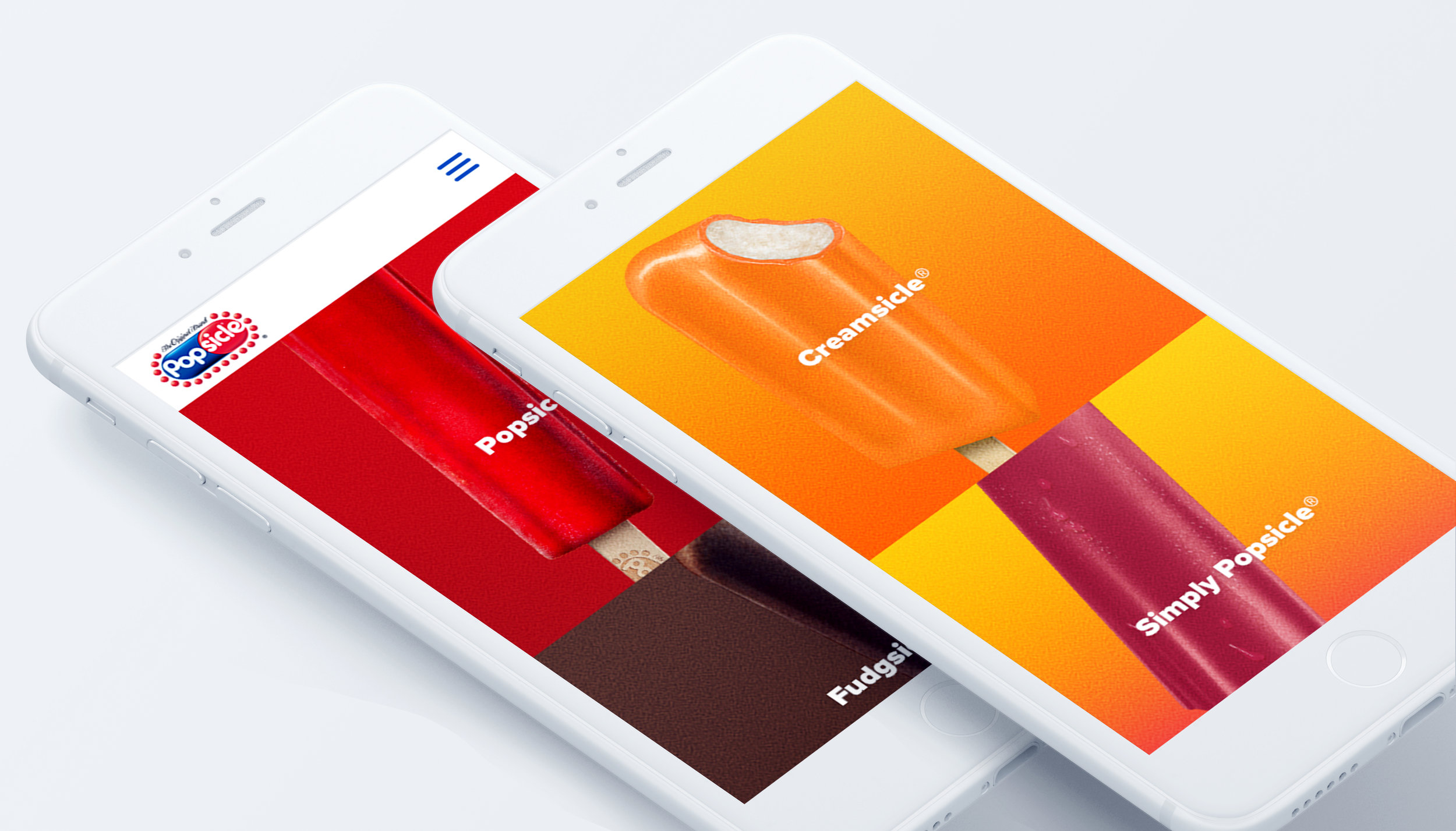
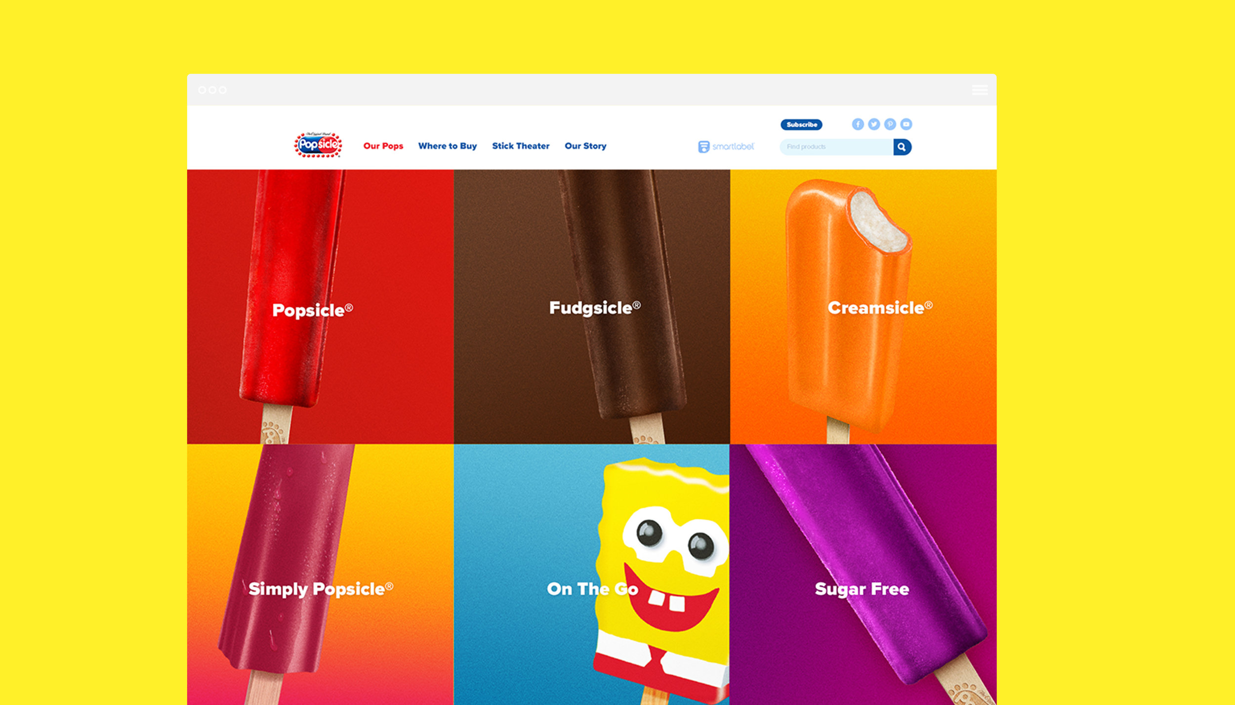
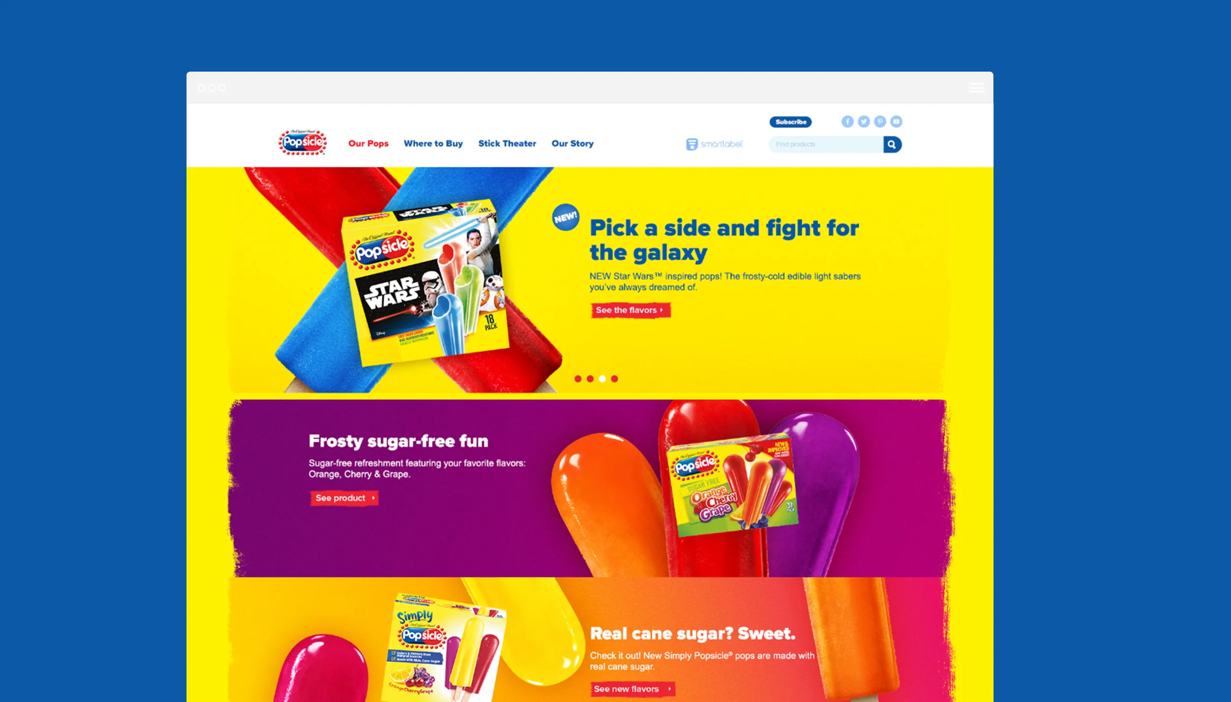
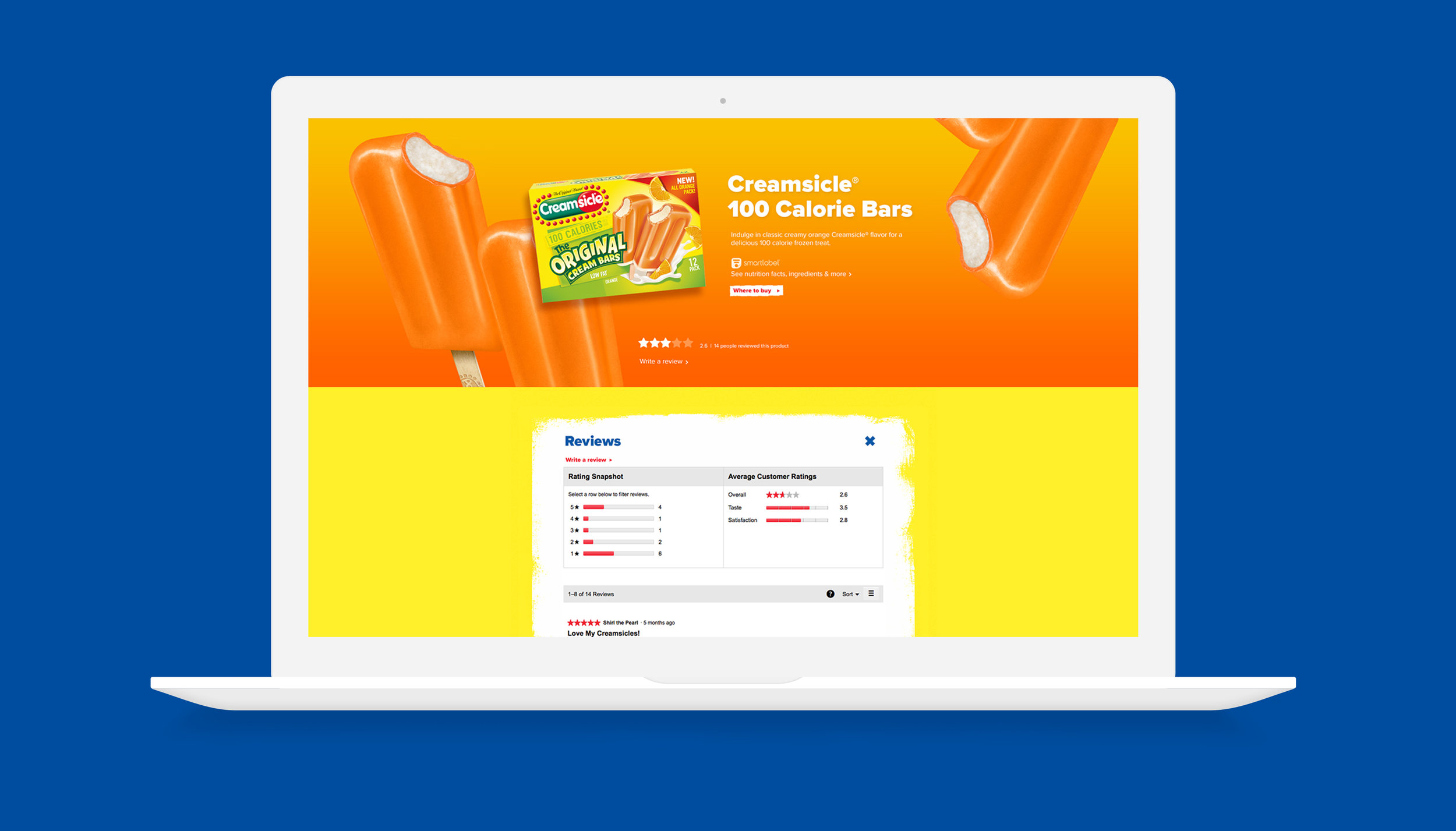
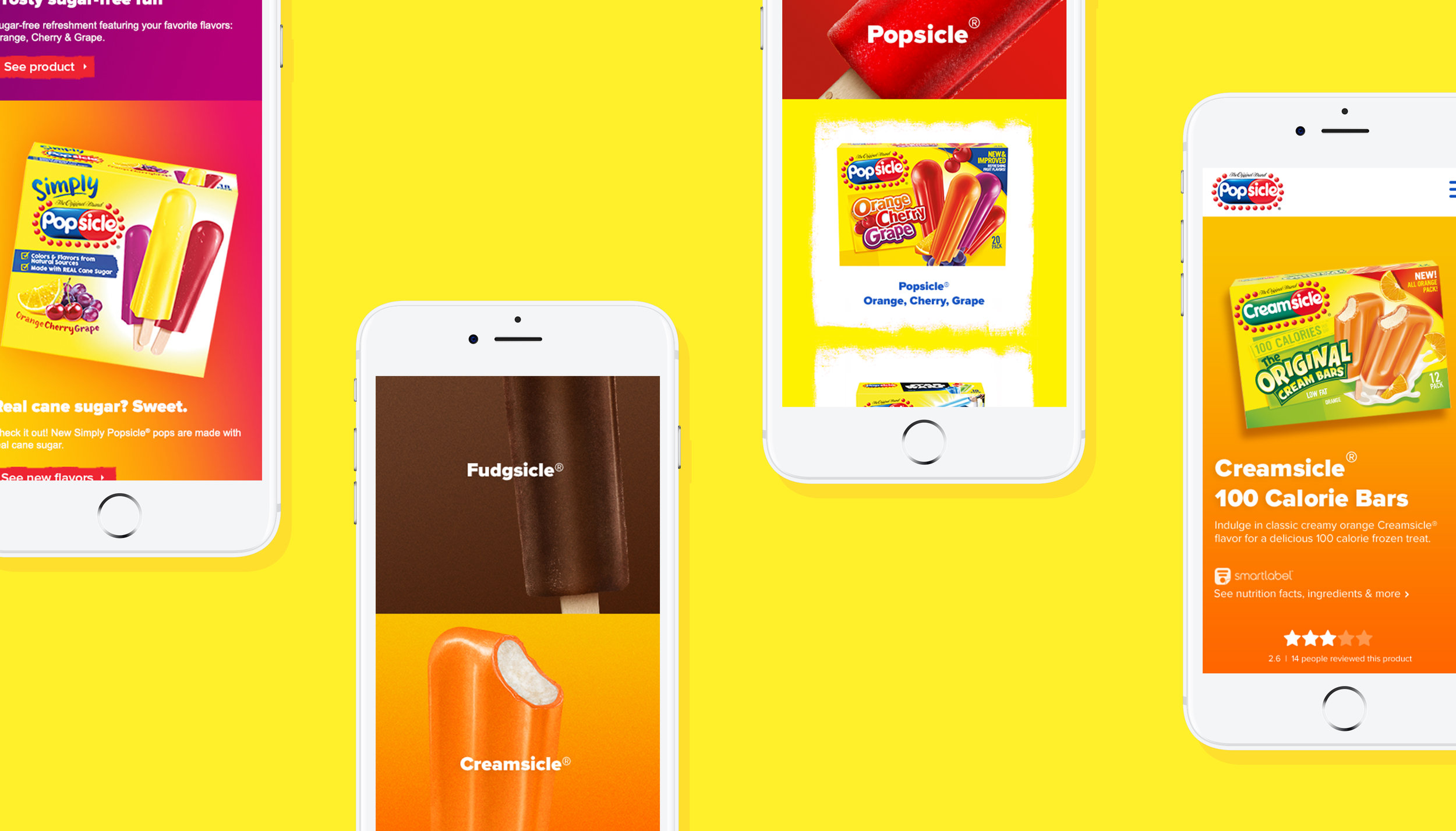
Clean & modern
We wanted to make Popsicle the bold and iconic brand that it deserved to be. Our goal was to take what makes Popsicle great—it's taste appeal, colors and bright yellow box—and bring its design into the modern age.
We started with an overhaul of fonts and implemented cleaner, simpler global elements. We chose bold colors, utilized crisp, close-up photography to drive taste appeal, and leveraged the curved shape of the Popsicle logo to influence input fields and drop-down menus. At the same time, we always kept in mind that Popsicle represents unrestricted fun and imaginative play.

Color & flavor
Bringing the rainbow of colors that Popsicles come in to the forefront was a high priority for us. We wanted users interacting with the site to be able to "taste" the juicy flavors with just visual stimulus alone, hoping to prompt cravings for Popsicle's refreshing treats in order to drive sales. Close-up, textured photography and bright gradients helped us achieve this goal. Time spent on the site went up over 200 percent.

Rounded corners
We also took the rounded corners of the iconic Popsicle logo and applied that style to different elements throughout the site, including the search bar and subject fields, drop down menus and social icons.

Cool Facts
In various places throughout the site, users were able to click on a popsicle which would activate an animation munching away at the pop to unveil a “Cool Fact”.

Always Summer
To tell the story of Popsicle, we created a fun illustrated beach environment inspired by the Always Summer campaign that was active at the time.